Dianne H. Cook
  • Home
  • Education
  • Publications
  • Talks
  • Software
  • Teaching
  • Students
  • Blog
Categories
All (21)
bug fixes (1)
community (1)
data mining (1)
data science (2)
data visualisation (6)
deep learning (1)
descriptive statistics (1)
dimension reduction (1)
education (1)
exploratory data analysis (1)
ggplot2 (1)
high-dimensional data (1)
interactive data analysis (1)
machine learning (1)
open source software (1)
R (5)
slides (1)
smart meter (1)
spatial data (1)
statistical graphics (2)
statistics (3)
teaching (1)
tidyverse (1)
time series (1)
tours (1)

Phase transitions in Stochastic Gradient Descent, from a High-dimensional Data Visualisation Perspective

R
high-dimensional data
deep learning
data visualisation
statistical graphics
dimension reduction
tours
data mining
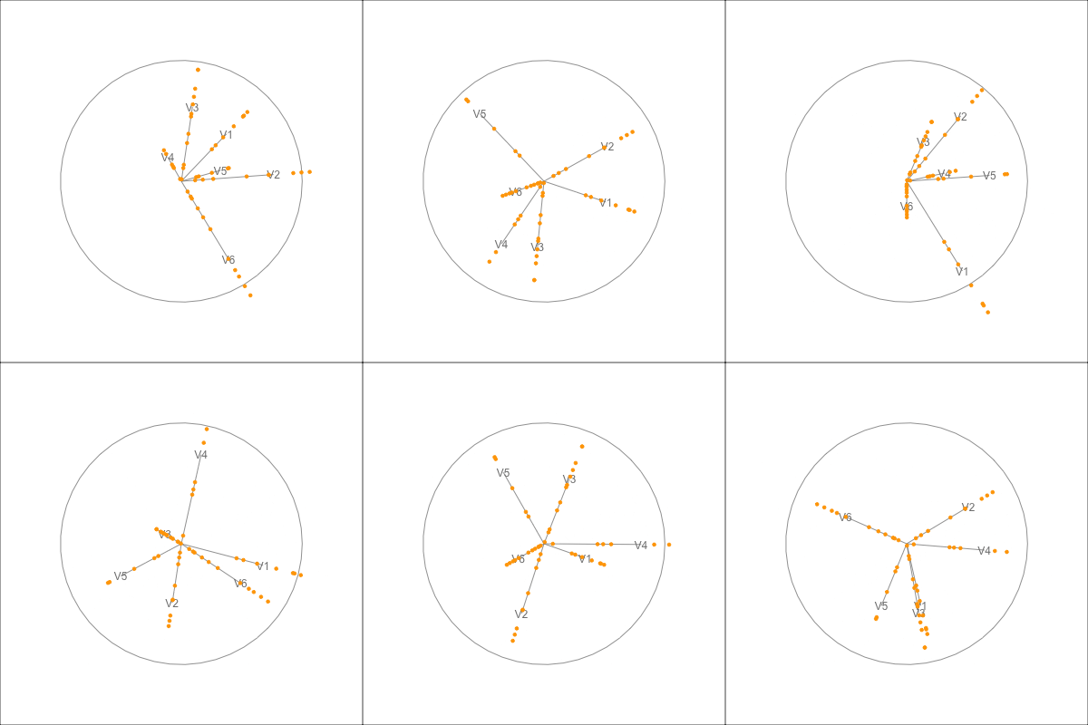
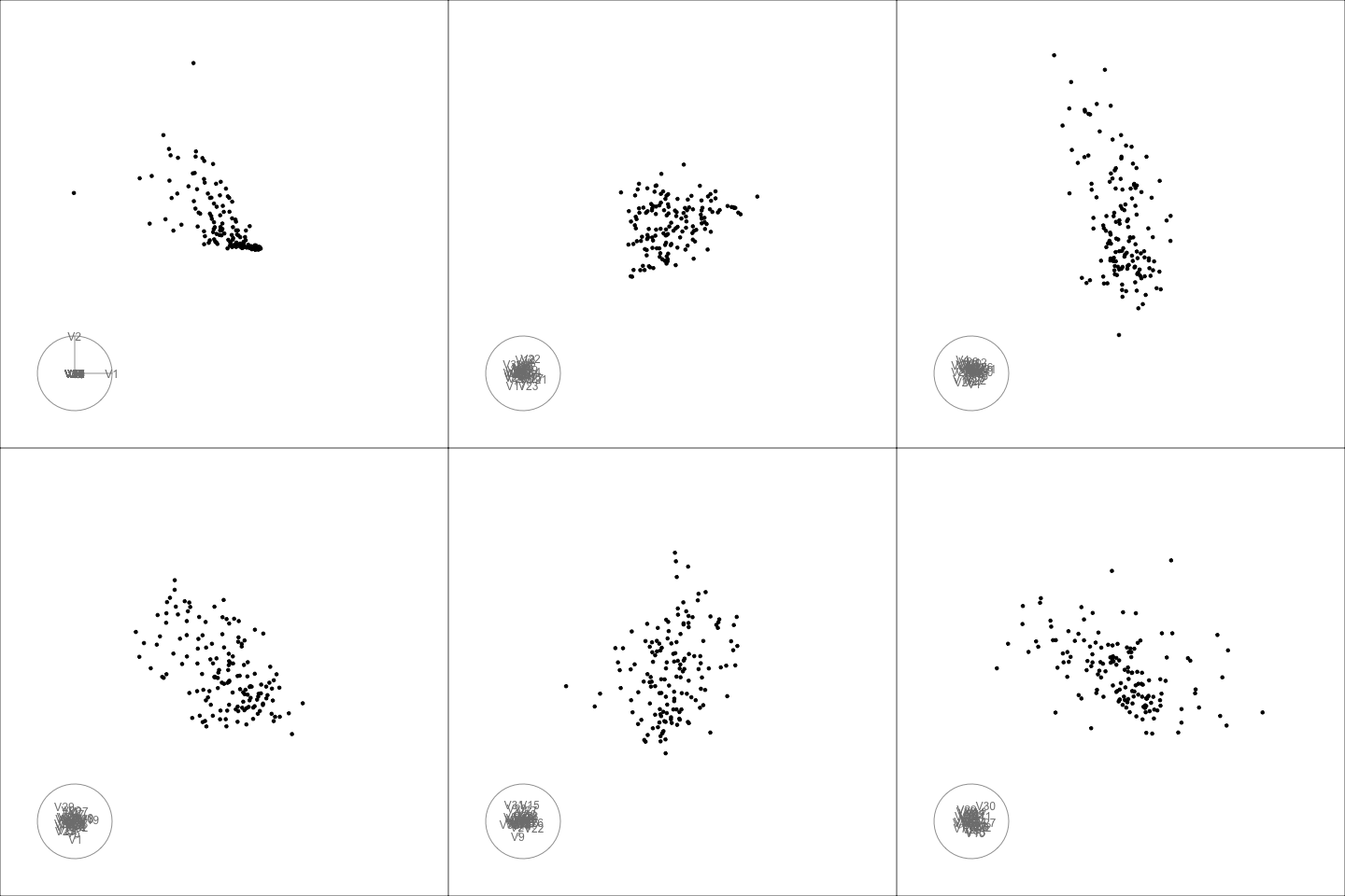
Susan Wei kicked off NUMBATs for 2025 last Thursday, with a talk about a recently completed project documented in this arxiv paper. The work is motivated by Toy Models of…
11 March 2025
Di Cook

What is EDA, really?

R
data science
descriptive statistics
exploratory data analysis
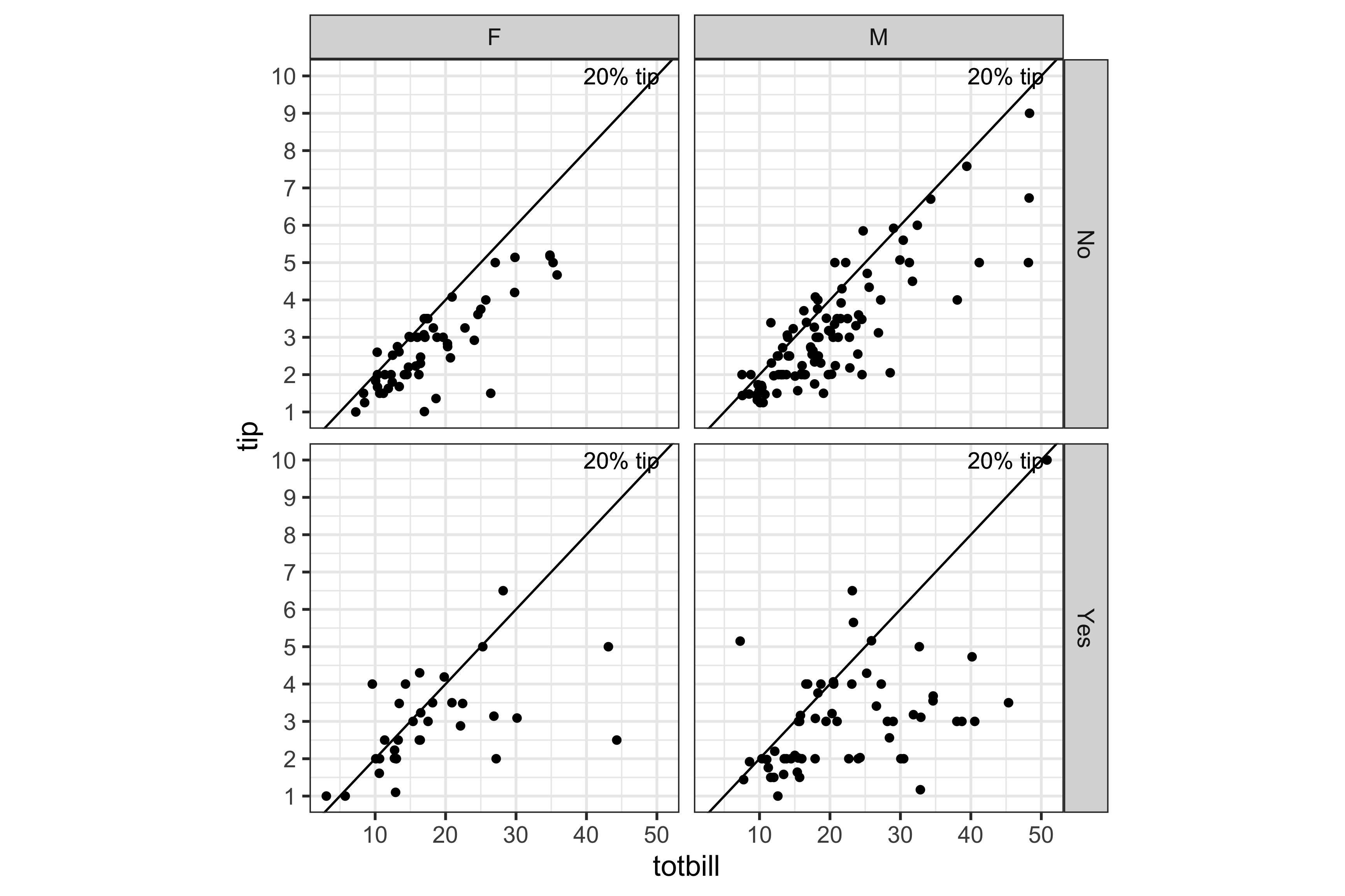
I’ve been meaning to write about this for several years, but Joe Cheng’s talk at posit::conf on Aug 14, 2024, precipitated the motivation to do it now. His talk slides are at …
26 August 2024
Di Cook

Tinkering with the core R code is easier than it used to be, thanks to R Dev Container

R
open source software
bug fixes
community
R Developers Day, organised by Heather Turner and Shannon Pileggi followed a very successful useR! 2024 in Salzburg, Austria. This was the opportunity to work alongside…
14 July 2024
Di Cook
 

Humans all the way down: statistical reflection and self-critique for interactive data analysis

interactive data analysis
statistics
data science
machine learning
25 June 2024
Di Cook, Rachel Franklin, Cagatay Turkay, Mari-Cruz Villa-Uriol, Levi Wolf
 

Hexmaps with sugarbag make it easier to see the electoral map

data visualisation
statistics
teaching
spatial data
Australia is a land of wide open spaces where the population concentrates in small areas. It can make for misleading map visualisations on statistics related to people. The…
21 May 2022

How to use a tour to check if your model suffers from multicollinearity

data visualisation
statistics
This was one of the comments from a recent review of a paper:
13 September 2019
Di Cook

The background to useR! 2018

useR! 2018 was held for the first time in the southern hemisphere, and the feedback from participants has been very positive. I have been asked to write about the…
10 October 2018
Di Cook
 

Getting past the little hiccups to getting plotly animations into slides

data visualisation
slides
I just gave a short talk at ISCB-ASC 2018 about visualising high-dimensional data, which involves showing dynamic graphics. In the past, I have run the tour, captured the…
29 August 2018
Di Cook

Analysing my energy usage

data visualisation
R
tidyverse
time series
smart meter
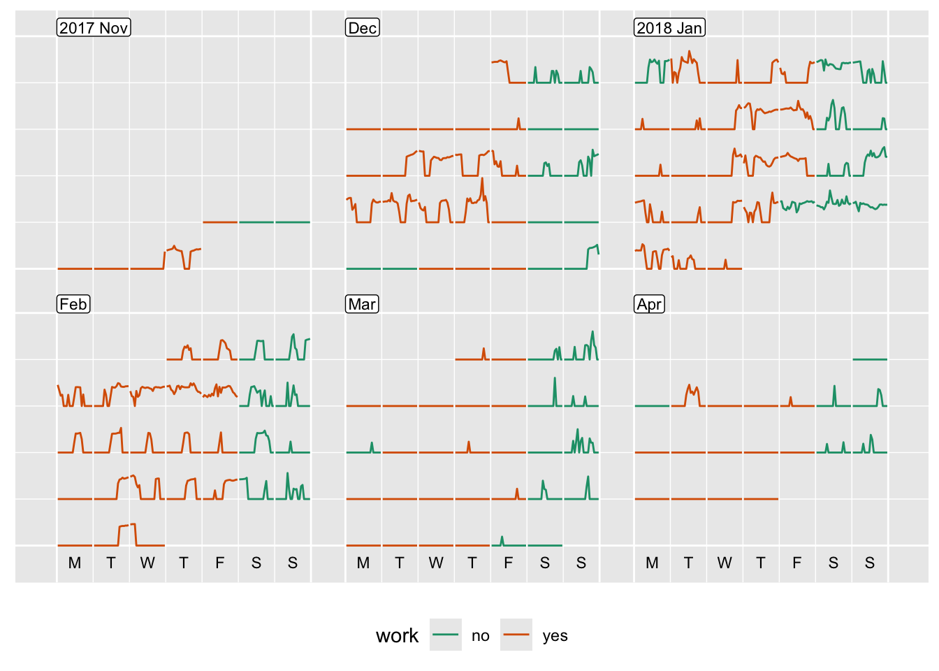
You can get access to your own electricity and gas usage data from https://www.citipower.com.au/our-services/myenergy. You will need a copy of your power bill, which has…
22 April 2018
Di Cook

Rookie mistakes and how to fix them when making plots of data

education
statistical graphics
data visualisation
R
ggplot2
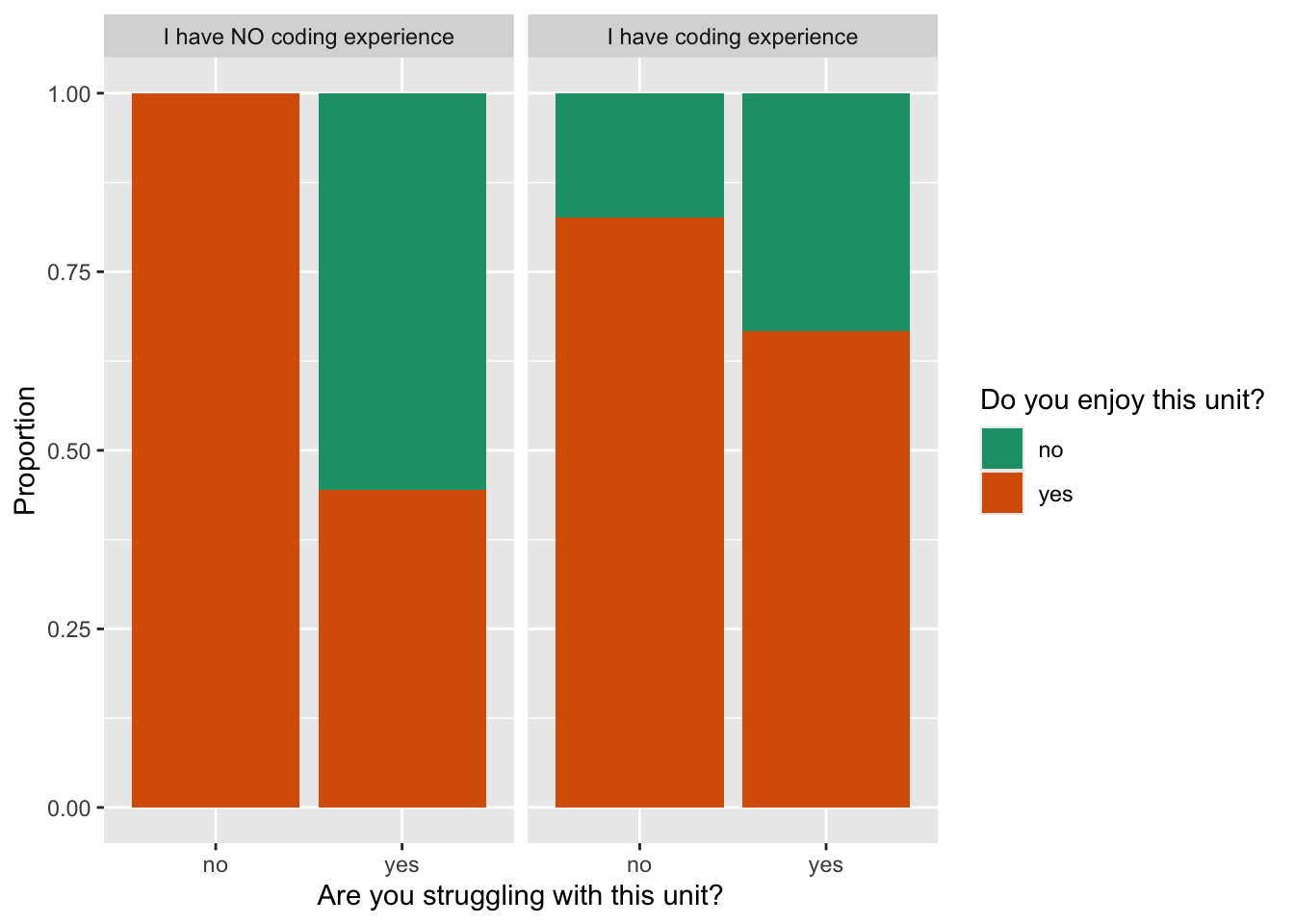
In this assignment, the focus was to practice data cleaning. Students suggested questions to build a class survey, to get to know the interests of other class members, and…
14 April 2018
Stuart Lee, Di Cook

Better cricket plots

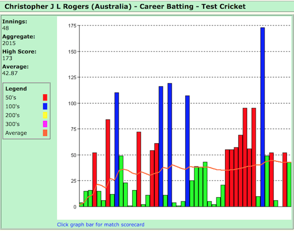
I’m sitting watching cricket tonight, the first day of the Australia vs West Indies Boxing Day test. Just now video of retired batsman Chris Rogers being honored was played…
26 December 2015
Di Cook
 

Statistical Sciences, Cornell University

This week I have been visiting the Department of Statistical Sciences at Cornell University. This is the home of many venerable statisticians. At first sight it appears that…
6 November 2015
Di Cook
 

Center for Statistics and Applications in Forensic Evidence

This week I have been visiting the new Center for Statistics and Applications in Forensic Evidence. The center involves four universities, CMU, ISU, UC-Irvine, U. Virginia…
26 October 2015
Di Cook
 

Data Science for Managers, 2015, Monash Conference Center, Melbourne

Spent a couple of hours this morning talking at the http://it.monash.edu/data-science workshop organised by Michael Brand from Monash University. Good questions, good…
13 October 2015
Di Cook

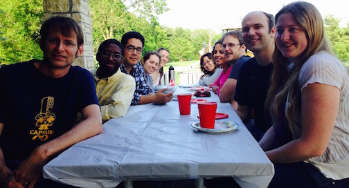
spring bbq 1

Graduates in Statistical Graphics Research at ISU 2015

Its exciting to report on the graduations from the working group this year.
17 May 2015
Di Cook

EDA at the UN

On Nov 10 I was part of a celebration of John W. Tukey at the United Nations. This event kicked off a new UN initiative called Unite Ideas. Details of the event, and the…
16 November 2014
Di Cook

New version of nullabor package released

The new version of nullabor contains numerical measures that quantify how close the plot of the data is to the null plots in a lineup. It is very difficult to quantify all…
3 November 2014
Di Cook
 

Statistical computing research

During the week, I received final confirmation notice that the special issue of Statistical Science that Vince Carey and I put together is finally published. There are four…
5 October 2014
Di Cook
 

How good is Nick Kygrios?

Nick Kygrios caught the world’s attention in July at Wimbledon 2014 when he beat world number 1 Rafael Nadal. After the match McEnroe commented:
28 September 2014
Di Cook

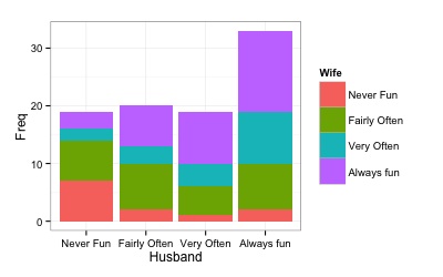
Facetted barcharts, and fluctuation diagrams are good alternatives to stacked barcharts

When there are two categorical variables it is common to make a stacked barchart. The stacked barchart primarily allows the reader to see the overall count, but it is harder…
25 September 2014
Di Cook
 

A Graphical Expedition into a Statistics Gradebook

It is always with a sense of unease that I reduce a whole semester’s work into a single letter grade, and to alleviate this feeling, I often pack the gradebook into an…
13 September 2014
Di Cook
No matching items